By Sean P. Ray | a&e editor
These days, it seems very difficult to escape movie advertisements. They show up on television, on the internet, on billboards; just about any place one can think of, they are there. However, while movie trailers seem to grow increasingly more exciting with each year, movie posters only seem to grow blander.
Consider some posters for classic movies. “Citizen Kane” had a very dynamic looking movie poster, with rich colors and an excitement to it that seeps all the way down into the font used. This kind of movie poster is eye catching and doubles as a beautiful work of art in and of itself, perfect for hanging on a wall.
Now, think about a modern drama movie. Let’s go with 2014’s “The Imitation Game.” What elements does that movie poster have? An uncomfortable looking Benedict Cumberbatch starring straight on at the viewer, with white text placed over his face and very muted colors. This poster is incredibly boring by comparison. Why show viewer’s the face of the man that they’re going to be looking at for the entire film with the blandest expression imaginable? It’s not eye catching and certainly not something I would be hanging on my wall anytime soon.
This is just one example of the incredibly bland movie poster design that Hollywood seems to love these days. “The Social Network” had a similar poster, with the lead actor giving an uncomfortable expression with white text over his face while saying nothing about the movie itself. “Her” was even worse, not even having the white text, just Joaquin Phoenix starring at the viewer. The poster gives no clues that the movie is an extraordinary story about a man falling in love with an A.I. that lives in his phone, an amazingly classic science fiction story.
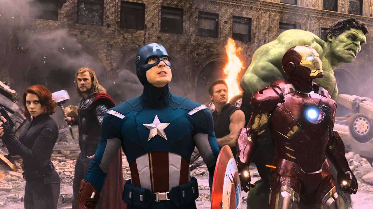
Bland poster design is not exclusive to drama films either. Big budget block busters like “The Avengers” or “Ant-man” seem content just to have their main characters standing together in some cool pose. We get it movie studios, these are the stars of the story, how about showing them doing something cool, like having “Ant-man” running up the barrel of a gun while shrunken or Thor battling Loki?
By comparison, look at “Star Wars” posters. They are gorgeously painted master pieces, displaying several key and exciting moments of each film. The first “Star Wars” poster has Luke standing in a heroic pose, lightsaber high in the air, with the looming head of Darth Vader in the background as a fleet of star ships race towards the Death Star. This poster screams excitement and draws one into the film, while not feeling the need to display ever single star actor on it (Han Solo is noticeably absent from the poster).
There are some hold outs for great poster design in this modern age. “Mad Max” had some, though not all, cool poster designs. I’m especially a fan of the one displaying Max starring up at an approaching War Rig truck, properly displaying the insurmountable obstacles our hero must face and the insanity of the villains of the movie. This is proper poster design, one that tells viewers something about the story or gets across some themes of it.
It’s quite astounding in a day and age where movie budgets constantly get bigger that so little effort and time is put into movie posters. After all, one can mute a movie trailer, but an eye catching poster hanging on a wall? That is hard to avoid and can draw in an even bigger audience than before.


