Naomi Girson | staff writer
If it ain’t broke, don’t fix it, and certainly don’t make it more dangerous and confusing.
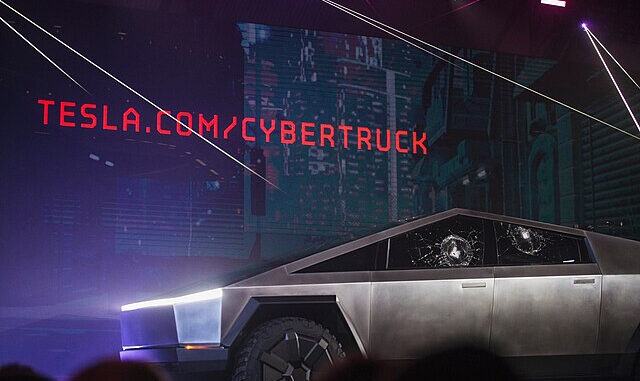
The face of futuristic automobiles is undoubtedly the 2024 Tesla Cybertruck, an all-electric pickup truck that has been plagued by a negative reputation since its release announcement in 2019, largely due to its angular stainless steel body.
The BBC reported that a man was driving his Telsa when it started to rain. Tesla designed their windshield wipers to automatically turn on with the detection of rain, but the settings for speed and intensity of the wipers were only accessible on the touchscreen.
The driver was trying to change them to his preferences and ended up in a wreck. He was charged as though he was on his phone while driving.
The rules of the road have not changed. It’s common knowledge that drivers should not look at their smartphones while driving. If there is an issue with visibility, and the driver is not focused on the road, it becomes a problem very quickly.
Steinberg Law Firm conducted research on the topic. “With the increase in technology in vehicles, we are seeing more distracted driving injury accidents,” said attorney and partner Steven Goldberg. “We know the dangers of cell phone use while driving and have laws around that – it may be only a matter of time before the statistics force laws around touchscreen use.”
Another example of needless innovation in cars is the evolution of the gear shift. Over many years, drivers have become accustomed to a physical gear shift lever. They know that park is at the top, drive is at the bottom and reverse and neutral are somewhere in the middle. After a while, use of the gear shift lever becomes muscle memory, allowing them to do possibly the most important thing a driver should do, keep their eyes on the road.
Manufacturers appear to have forgotten this basic principle and are implementing button and dial gear shifters. The lever existed because drivers had to manually shift the gears in their car. Most cars have switched to automatic shifting, but kept the same general look for the shifter. More recently, cars have gained innovative shifters that break the old habits the stick shift created for drivers and their muscle memory. Designers want to be creative but don’t seem to know how to be practical.
One example is GMC’s “electronic precision shift” which debuted in the 2018 GMC Terrain. The company spent three hours highlighting the new feature, all the while insisting that their new system is “not confusing,” according to Car and Driver.
Mark McNabb, reviewed the gear mechanism in Topspeed.com. “I’ve found the E-Shifter doesn’t require extra brainpower to operate, but does require my eyes,” he said.
In 2020, Tesla was under fire for a design oversight, in which they built the control for the windshield wipers into the touchscreen of the Model 3.
Vi Bilägare, a Swedish car magazine, conducted a study in which they tested cars with touch-screen amenities, compared to the tactile dials and buttons that an old school Volvo offered.
They allowed their drivers to become comfortable with their cars, and then had them do a series of tasks, including controlling the music and car climate. Their data came from the length of time users spent doing tasks, and looking away from the road, backed with both time in seconds and distances in meters. All cars were driven at the same speed.
“The easiest car to understand and operate, by a large margin, is the 2005 Volvo V70. The four tasks [are] handled within [10] seconds flat, during which the car is driven 306 meters at 110 km/h.”
The tasks were able to be completed in 10 seconds keeping the driver satisfied and the road safer. The longest amount of time to do the tasks was 44.6 seconds, more than four times the length that it took a driver in the Volvo.
When it comes to driving, simpler is better.

