
Adam Lindner | Sports Editor
May 19, 2019
Just wait until your Duquesne-loving elders find out about this one.
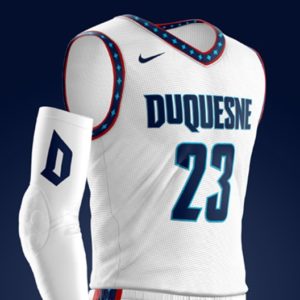
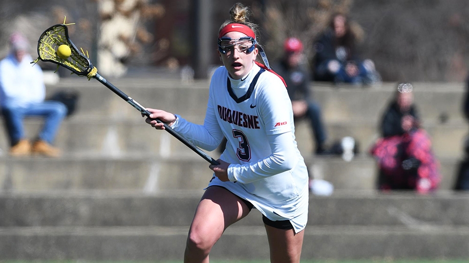
On May 15, Duquesne University revealed a new, revitalized visual identity for its 17 varsity athletic programs, complete with a sharp-edged monogram ‘D,’ brand-new typefaces and the addition of electric blue to the teams’ color palette, among other changes.
The brand transformation comes amidst UPMC Cooper Fieldhouse renovations as well as the resurfacing of Arthur J. Rooney Athletic Field. According to an email from the university, Rooney Field construction will begin on May 20 and is planned for a June 30 completion.
“This is the ideal time to reimagine our brand identity,” Duquesne Athletic Director Dave Harper said in a web release. “Having a strong and recognizable mark is essential as we continue to elevate the profile of Duquesne athletics.”
Duquesne partnered with Change Up, a branding agency that has worked with the likes of Best Buy, T-Mobile and Buffalo Wild Wings, for the transformation. According to a web release on the school’s athletics website, “the Department of Athletics and Change Up engaged partners on campus as well as current and former members of the athletics community throughout the rebranding effort which spanned nearly 18 months.
“Focus groups included past and current student-athletes, coaches, Duquesne students, staff and alumni. The process also included feedback from Duquesne’s athletics apparel partner, Nike.”
Faced with the choice to either evolve or revolutionize Duquesne’s brand, respondents overwhelmingly chose to revolutionize the school’s image. It’s evident in several facets that Duquesne focused on personalizing its new identity as much as possible, with numerous nods to Duquesne’s history, its Spiritan background, the Bluff neighbourhood and Pittsburgh evident throughout the latest design scheme.
The department’s new primary typeface was customized exclusively for Duquesne’s usage. The font, called “The Bluff,” is described as “a strong, condensed typeface with an aggressive appearance.” It only features uppercase letterforms, and is named for Duquesne’s geographical location within Pittsburgh’s Bluff neighbourhood.
Duquesne’s newest monogrammed ‘D’ is described as “modern gothic.” On an Adobe Spark link provided by the university’s athletics site, it’s explained that the “narrow, angular features give the monogram a gothic aesthetic and echoes our Spiritan flame. These subtle nods provide a connectedness to the larger, University brand while also establishing a clear and distinct identity for athletics.” The monogram will serve as the athletics program’s leading logo.

As opposed to a blockish font in the past, Duquesne’s newly-implemented wordmark exudes an increasingly confident look, complete with strong, vertical accented letters.
Interestingly, the first ‘U’ in ‘Duquesne’ is depicted as shorter than that of the second ‘U’; it’s meant to provide a subtle visual cue of the verbal pronunciation of ‘Duquesne.’
“It was a priority of ours to incorporate key University and Pittsburgh elements into our new visuals,” Harper said. “As much as this new look is essential to rebuilding our image, we must combine academic excellence and competitive success along with our new images to truly elevate our brand across the board.”
Notably, electric blue and silver will now be used in supplementary roles. Electric blue hypocycloids will be introduced as an additional accessory to complement the school’s contemporary navy-and-red color scheme.
Other changes include the addition of a primary abbreviation — ‘DUQ’ — that will be used in conjunction with the school’s other logos. Two line patterns, titled “The Range” and “The Ripple,” were “both built off the angled nature of the monogram and rooted in our Pittsburgh environment.”
The news was met with mixed reviews on social media.
Duquesne football running back A.J. Hines joked on Twitter, “I can’t lie.. that D is HIDEOUS,” followed by a palm-to-face emoticon. Conversely, Duquesne men’s basketball forward Mike Hughes voiced his support of the new identity, tweeting, “Level up,” attached to a video detailing DU’s new identity.
A Twitter poll asking respondents for their opinions on the new look, shared on The Duquesne Duke’s sports Twitter profile — @TDD_Sports — received 64 votes, with 36% of voters choosing “No, hate it” as their response. Similarly, 36% selected “It’s alright,” while 28% voted “Yes, love it.”
Multiple web pages detailing Duquesne’s newest design scheme are accessible on Duquesne’s athletics website.


